
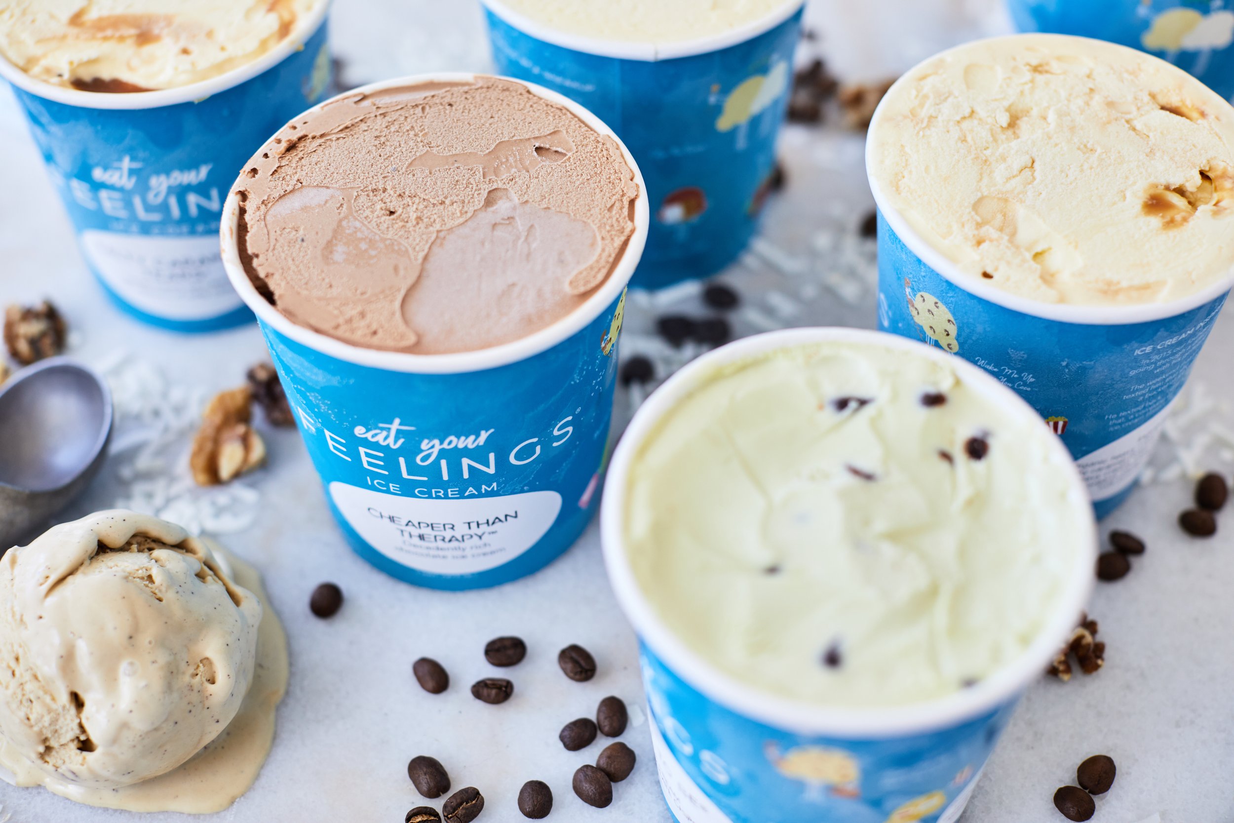

Eat Your Feelings
Brand Identity & Packaging System
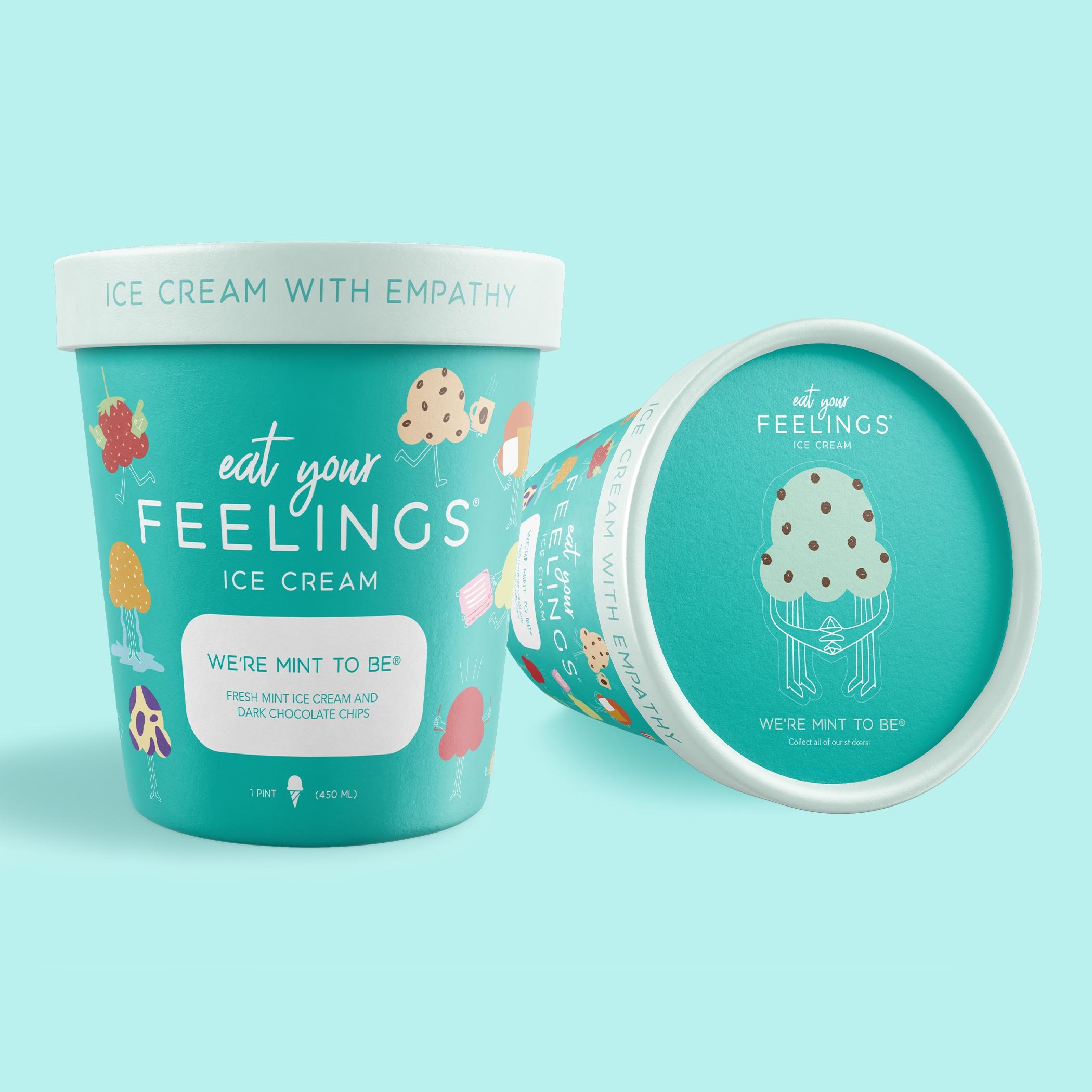
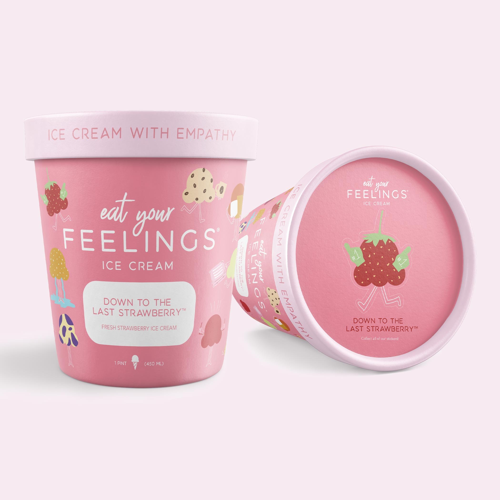
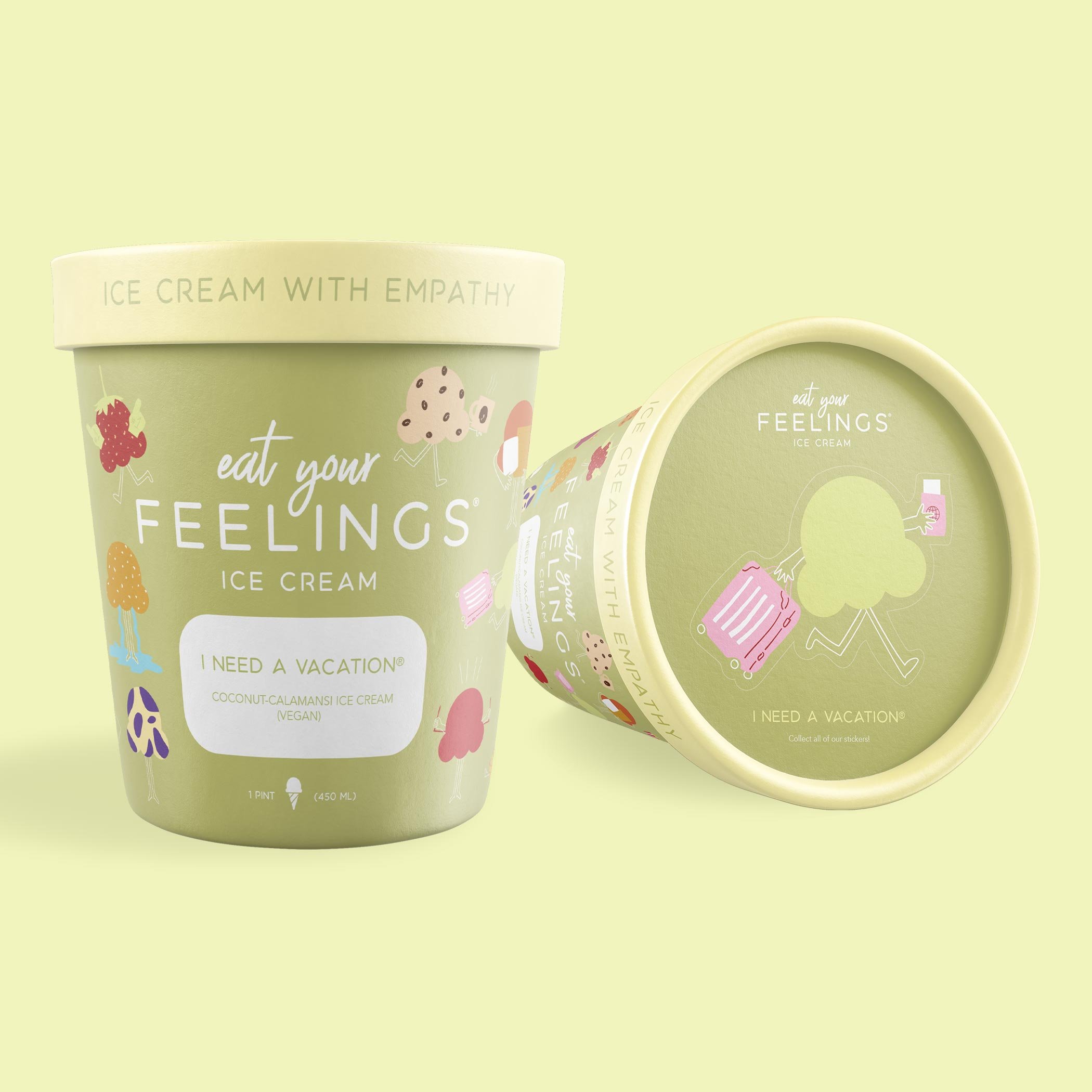
Eat Your Feelings is a snack brand rooted in emotional honesty, humor, and self-expression. I brought the brand to life by translating its personality into a bold, flexible visual system designed to be eye catching and cohesive at the grocery aisle.
Studio: Compose[d]
I defined the core visual principles that would guide the brand, establishing a distinct color system, typographic voice, and illustrative language. The identity was intentionally designed as a modular system, allowing individual flavors and expressions to vary while maintaining strong brand recognition.
Through iterative exploration and refinement, I tested color combinations, hierarchy, and packaging layouts to ensure clarity, impact, and consistency in a physical retail environment. Every design decision considered how the brand would scale, flex, and extend beyond a single product or format.

Ultimately, we felt a scoop of ice cream was the best character to represent Eat Your Feelings!

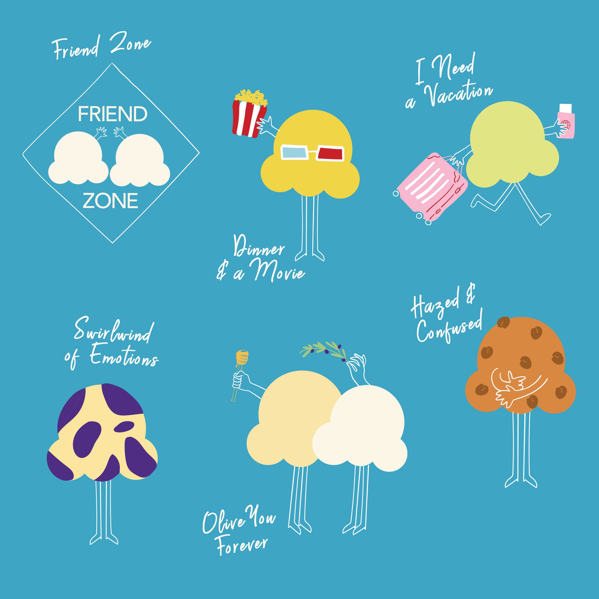
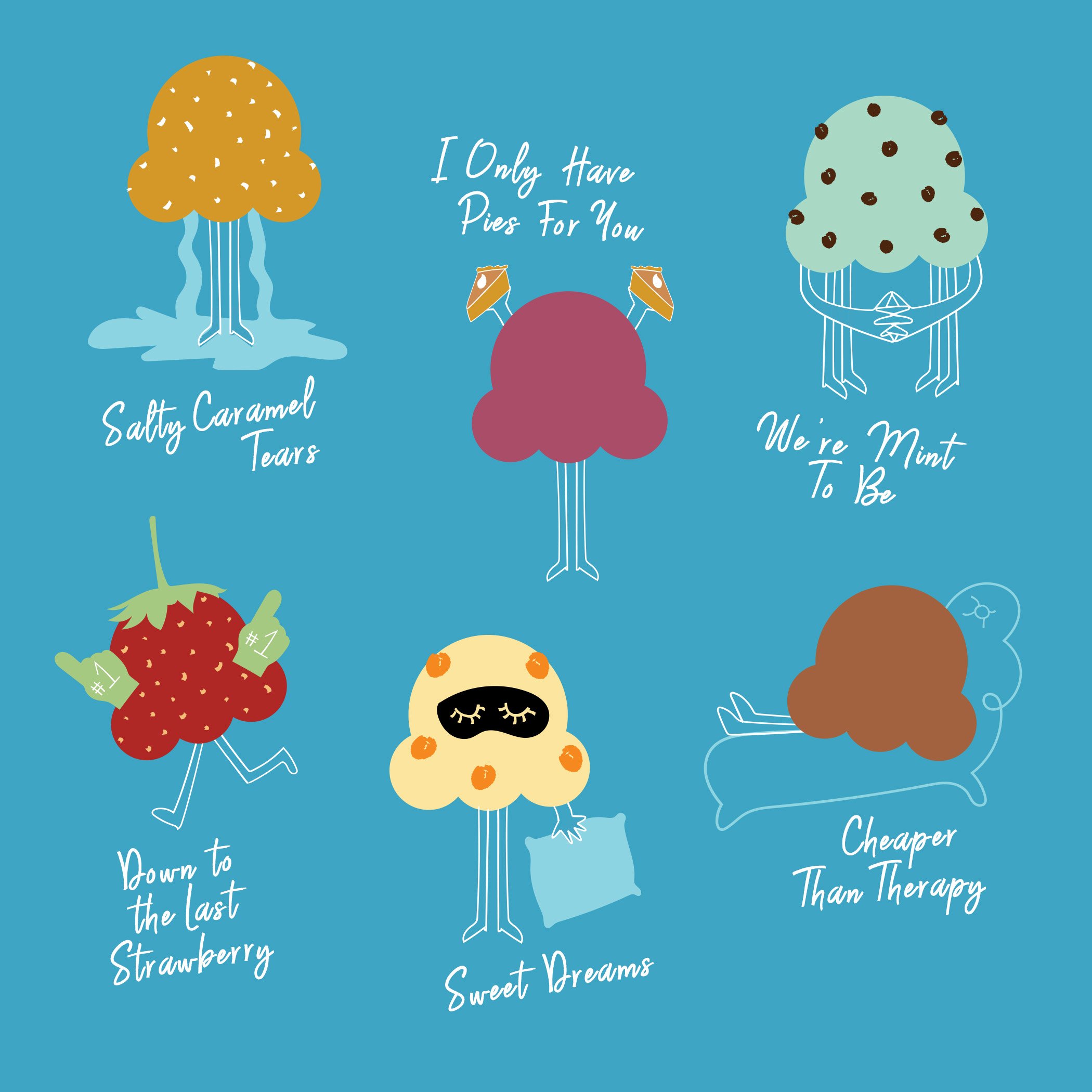
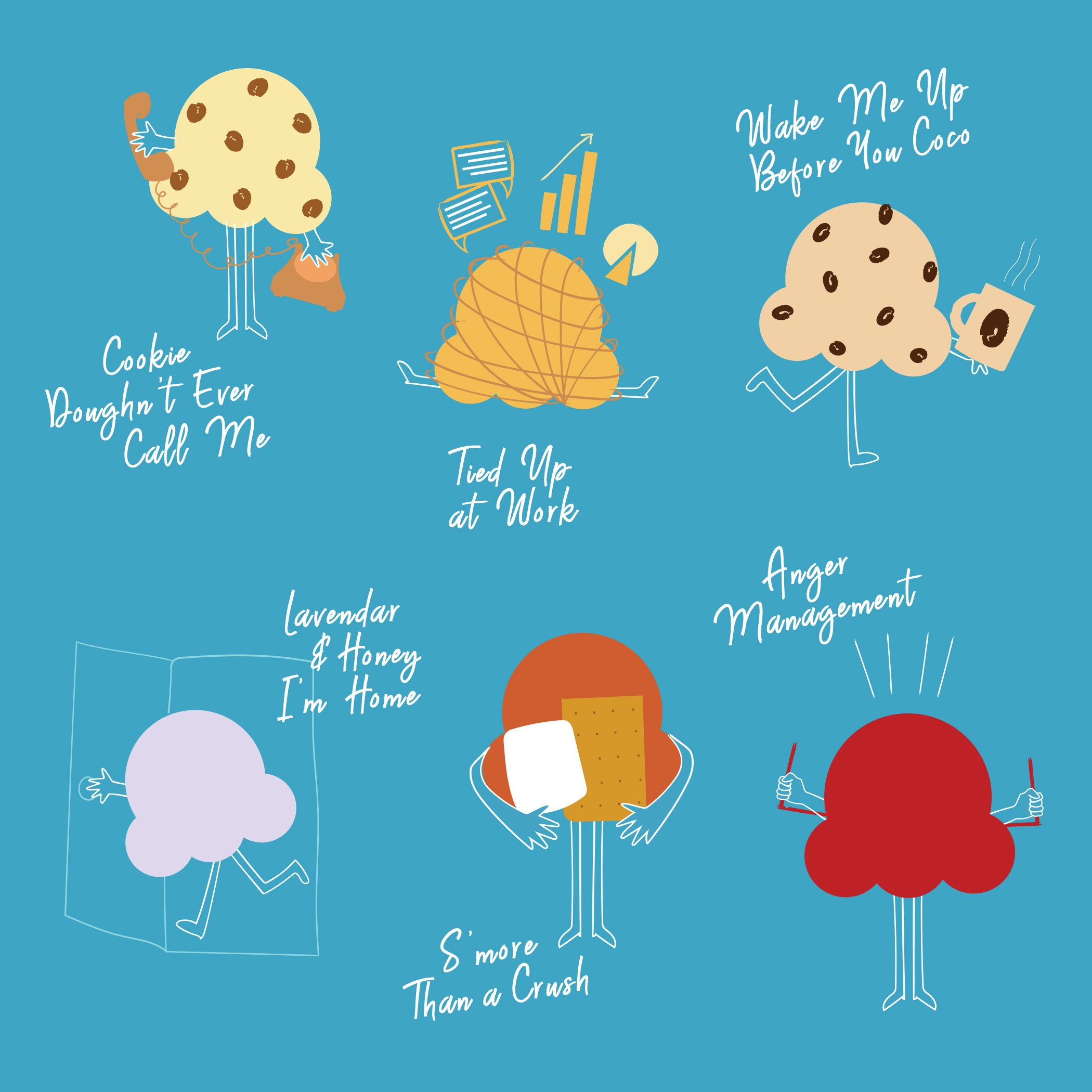
The final system translated seamlessly across packaging, brand visuals, and future extensions, providing a strong foundation for growth. The result is a confident, expressive identity that balances playfulness with structure and functions as a durable brand system rather than a one-off design.
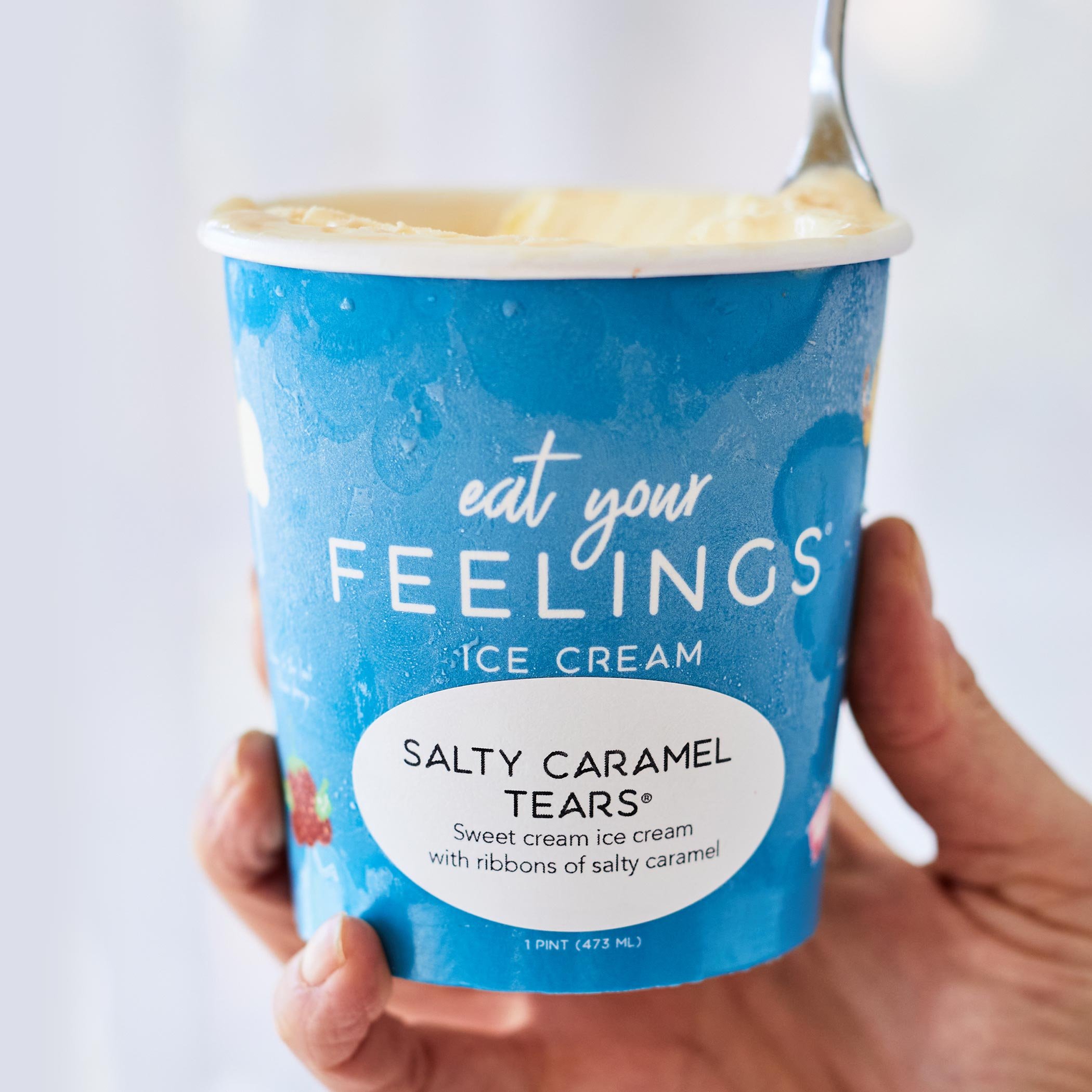
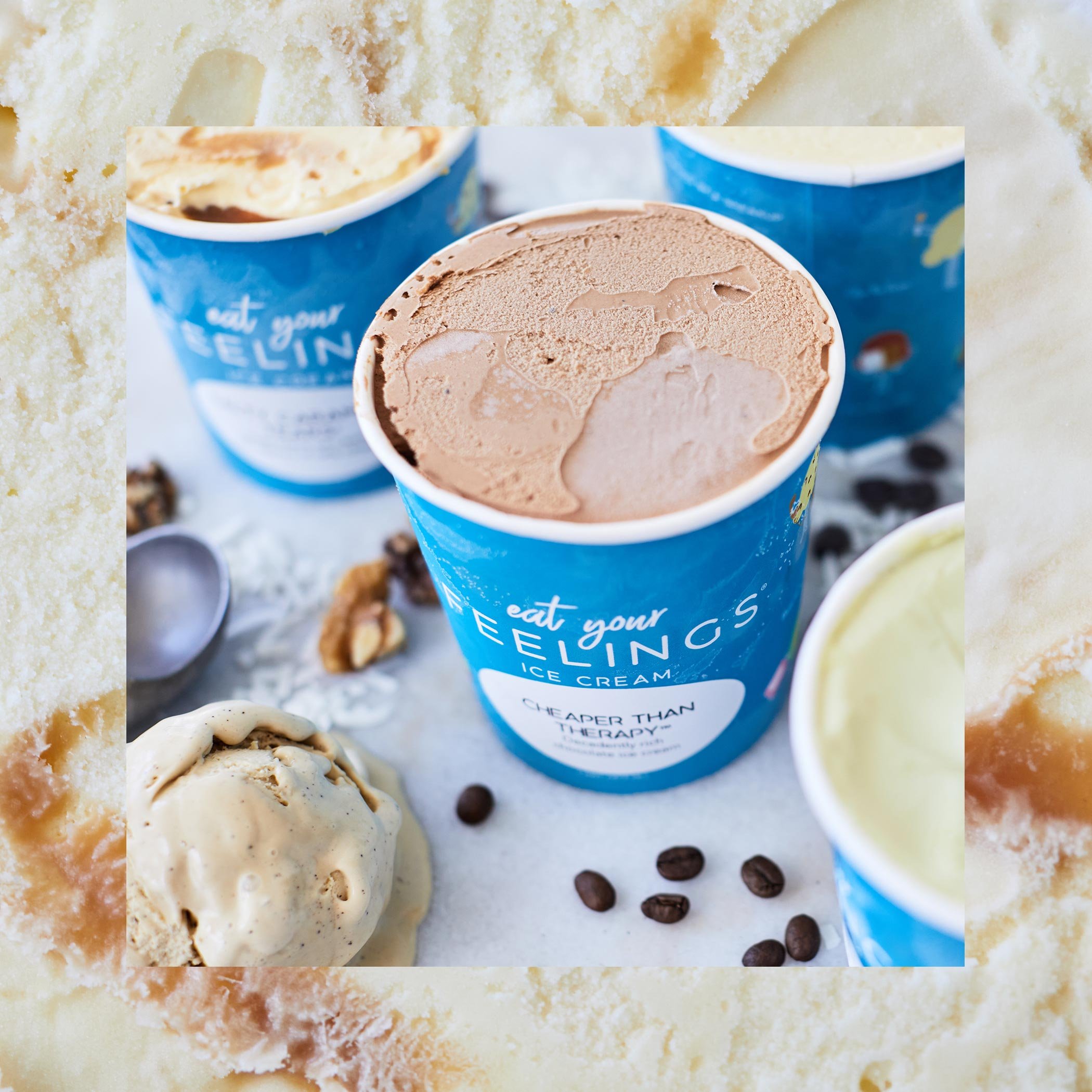
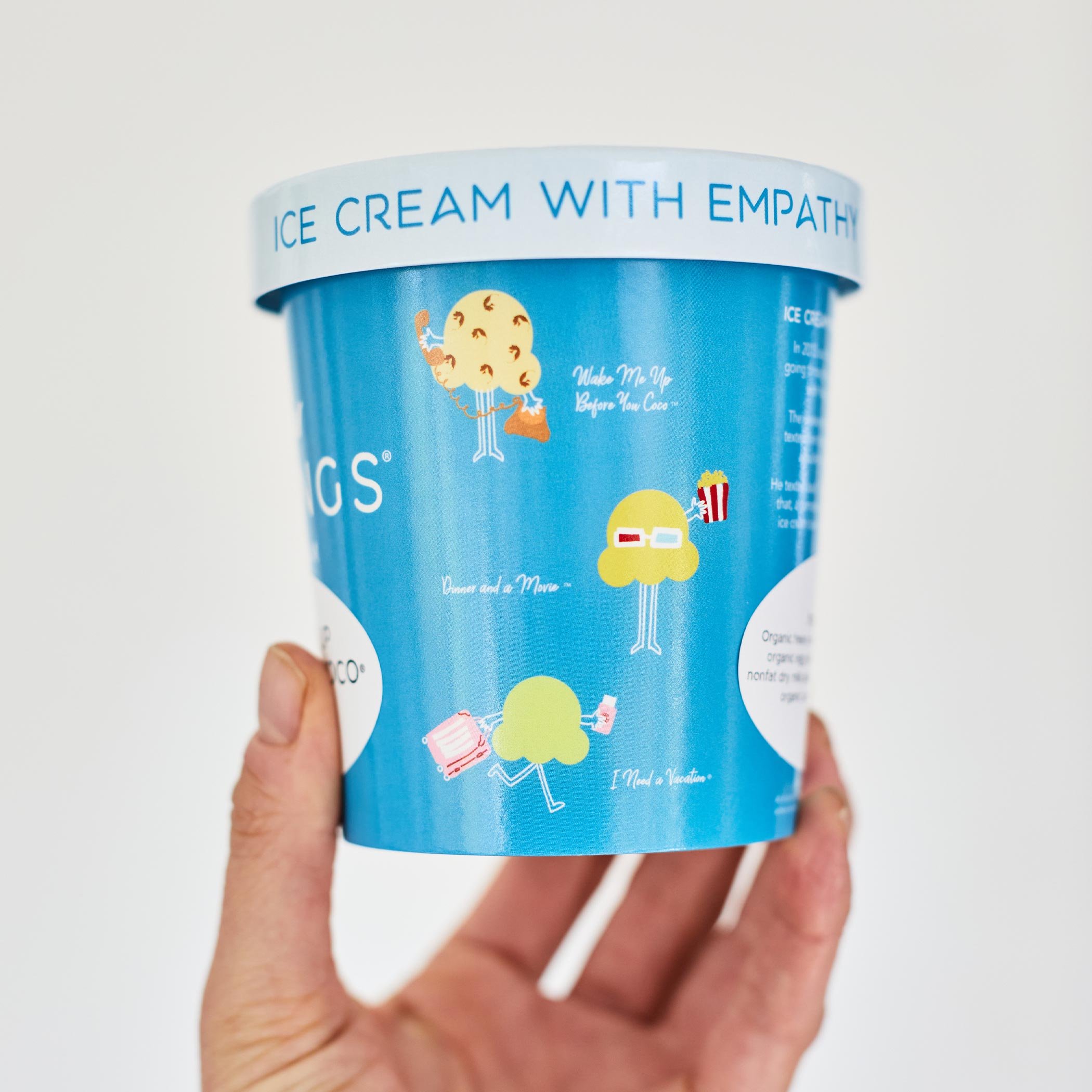
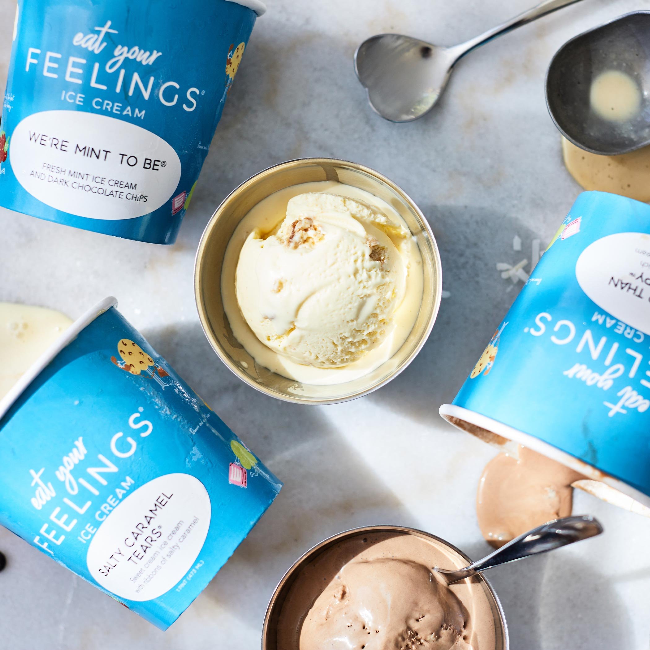
While the initial stage was focused on producing one pint decal and flavor stickers, phase 2 would have their own pint decals for individual flavors.
Photography:
Noah & Lisa